WED 6–9PM
THU–FRI 2–9PM
SAT–SUN 11AM–9PM
*garden 2AM
TUE 6–9PM
WED–FRI 2–9PM
SAT–SUN 11AM–9PM
*garden 12PM
*Studio Orson Welles
Studio Orson Welles
Jadran film
Studio Orson Welles
Ul. Rudolfa Kolaka 12
10000 Zagreb
TUE 6–9PM
WED–FRI 2–9PM
SAT–SUN 11AM–9PM
*garden 12PM
WED 6–9PM
THU–FRI 2–9PM
SAT–SUN 11AM–9PM
*garden 2AM
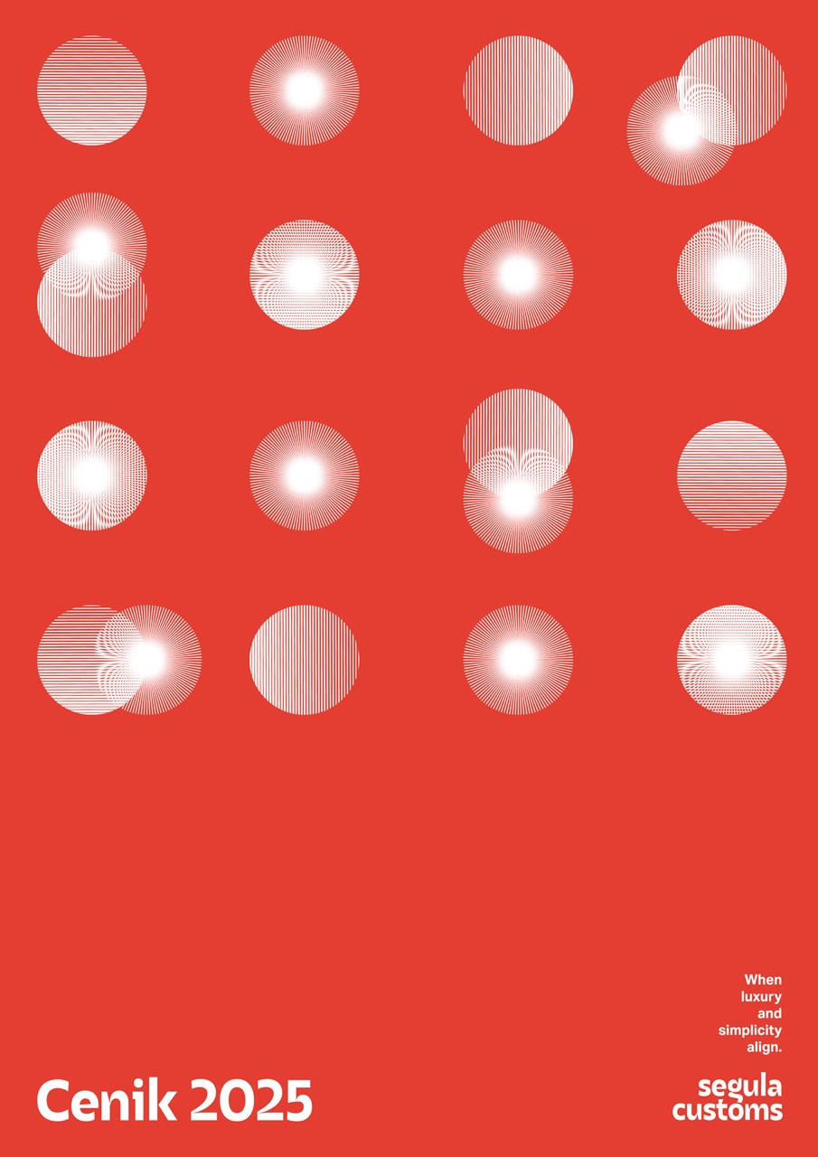
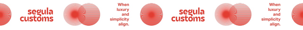
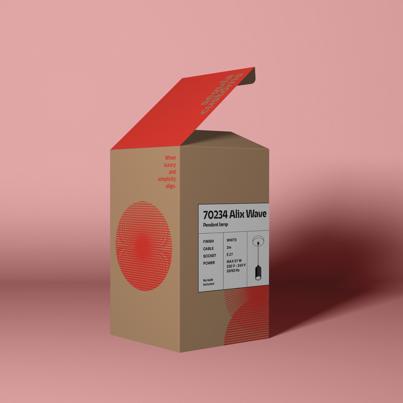
The visual identity for Segula Customs is rooted in a single, powerful design element: the line. In physics, light is described as the motion of photons, a concept best represented visually by the line. This idea became the foundation of the entire branding system.
The wordmark was inspired by a line pattern featured on Segula’s products. Although the actual lines are straight, they create an optical illusion of curvature. This inspired the custom design of the letter “g”, which mimics the product’s iconic curved form. The typography features strong contrast and a refined, tailored look, mirroring the bespoke nature of Segula’s lighting products.
The visual identity expands this concept through graphics that echo optical illusions and line-based forms. A signature symbol was created by merging two geometric shapes, visually expressing the brand’s tagline: “When luxury and simplicity align.” This symbol represents the intersection of refined elegance and minimalist clarity, reinforcing the brand’s core philosophy.
Barbara Borko is a graphic designer, entrepreneur, and design enthusiast who travels, explores, learns, and experiments constantly. Since 2013, she has been working as a freelance designer with both small and large international clients on a wide range of projects in print, branding, and visual identity. Her past collaborators include the Liechtenstein royal family, Samsung Austria, NGI, Berkeley Institute for Data Science (BIDS), Dr. Heinekamp, and Edition Hotels. Since 2016, she also curates creative content through her platform @designneeds and the website http://www.designneeds.co/.